
Tools
Adobe Photoshop
Adobe Illustrator
Adobe After Effects
Adobe Firefly
Responsibilities
Creative Direction
Brand Strategy
Graphic Design
Timeline
5 weeks
October 2025 -
November 2025
Collaborators
Ibrahim Ma
(Photographer)
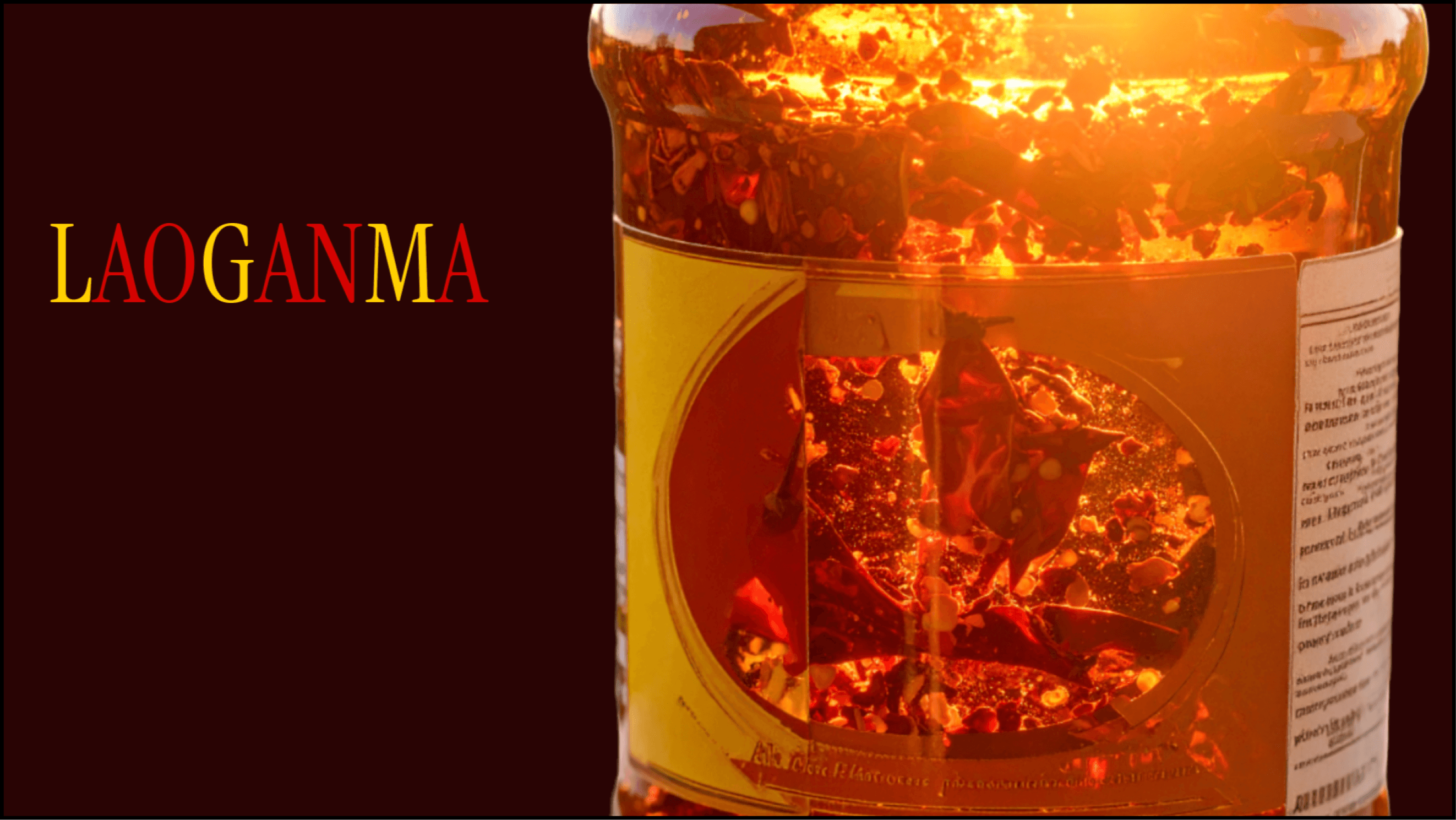
LAOGANMA
A speculative rebrand of a cultural icon to bring it into the digital era for a wider range of generations.
Understanding what Lao Gan Ma is missing
Lao Gan Ma is a household name, and it got to that level based on product alone. This means its decades of loyal customers and global shelf presence were achieved through zero marketing. This may have worked in the past, but today it becomes a problem.
Chinese culture is currently trending, with the hashtag #china exceeding 33 million posts. This means that Lao Gan Ma's missing a huge opportunity for growth. Its current visual identity is dated and lacks the energy and digital presence needed to resonate with Gen Z consumers. The question I set out to answer:
How do you bring one of the world's most recognizable products into the digital age without losing what makes it iconic?
The gap between being iconic and being effective
I started with identifying the values and learning the history of Lao Gan Ma as a brand.
Authenticity
Product quality
Pride in tradition
Next I sought out an understanding of Lao Gan Ma's current audience and my desired audience to target their needs,
Original Demographic
Age: 40-50
Race: East Asian
Class: Low-Middle
Motivation: Parents with families, immigrants away from home.
Target Demographic
Age: 18-25
Race: Any
Class: Middle-High
Motivation: Foodies, food influencers, trend followers.
To understand the current industry, I compared Lao Gan Ma to competitor brands that appealed to the target demographic I identified.
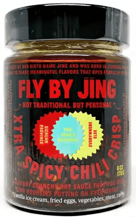
Fly by Jing
- 141K Instagram followers - 1 website for all needs - Emphasis on social media
Lao Gan Ma
- No Instagram - 3 different scattered websites - No social media presence
However, Fly by Jing recently came into public scrutiny from claiming to invent/misrepresenting Chinese cuisine. I associated this failure from a lack of authenticity and tradition, traits which happen to be two of Lao Gan Ma's main brand values.
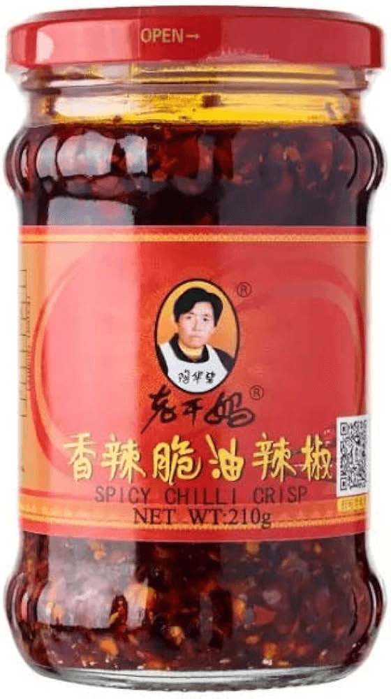
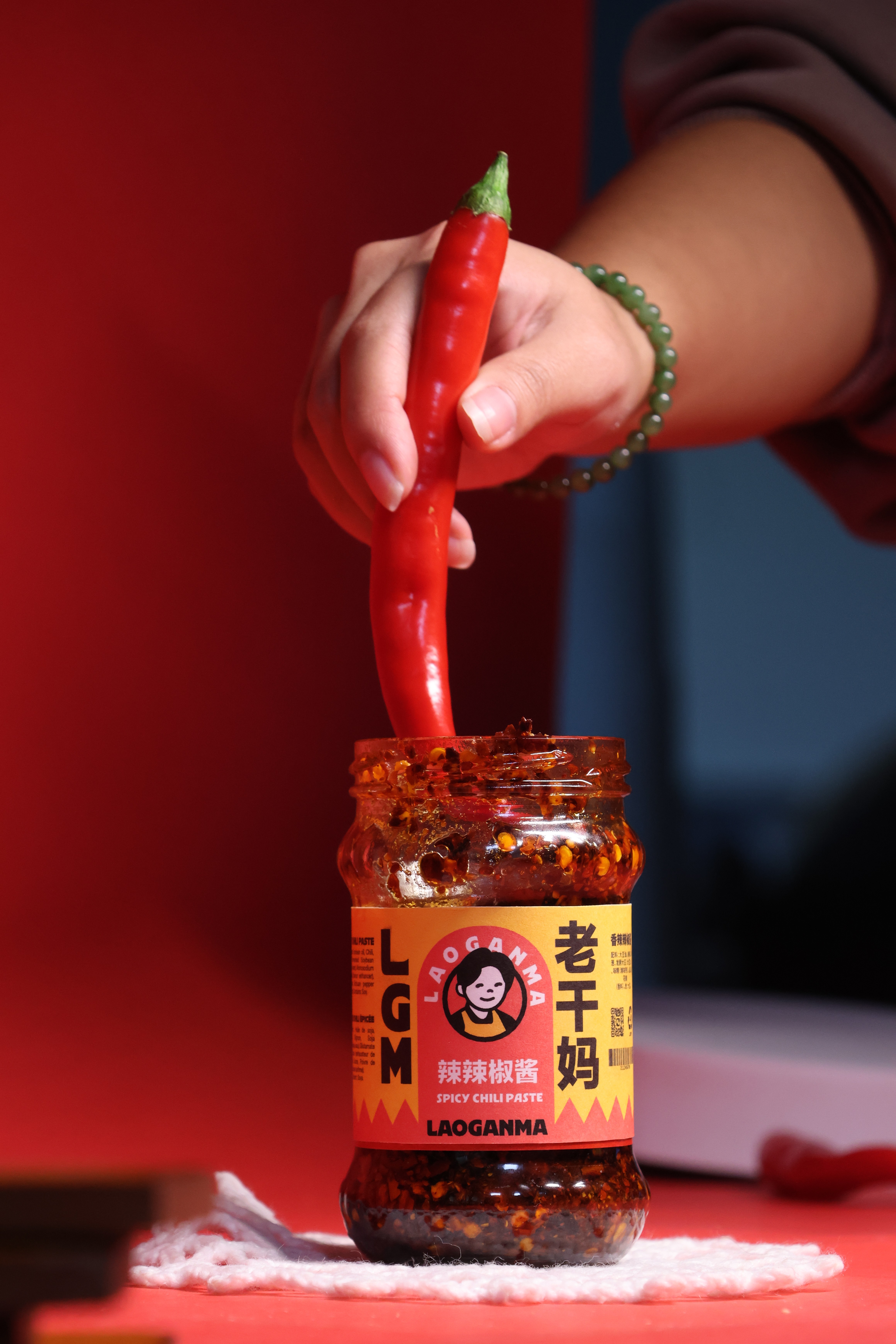
I studied Lao Gan Ma's visual identity, from online content to the physical product.
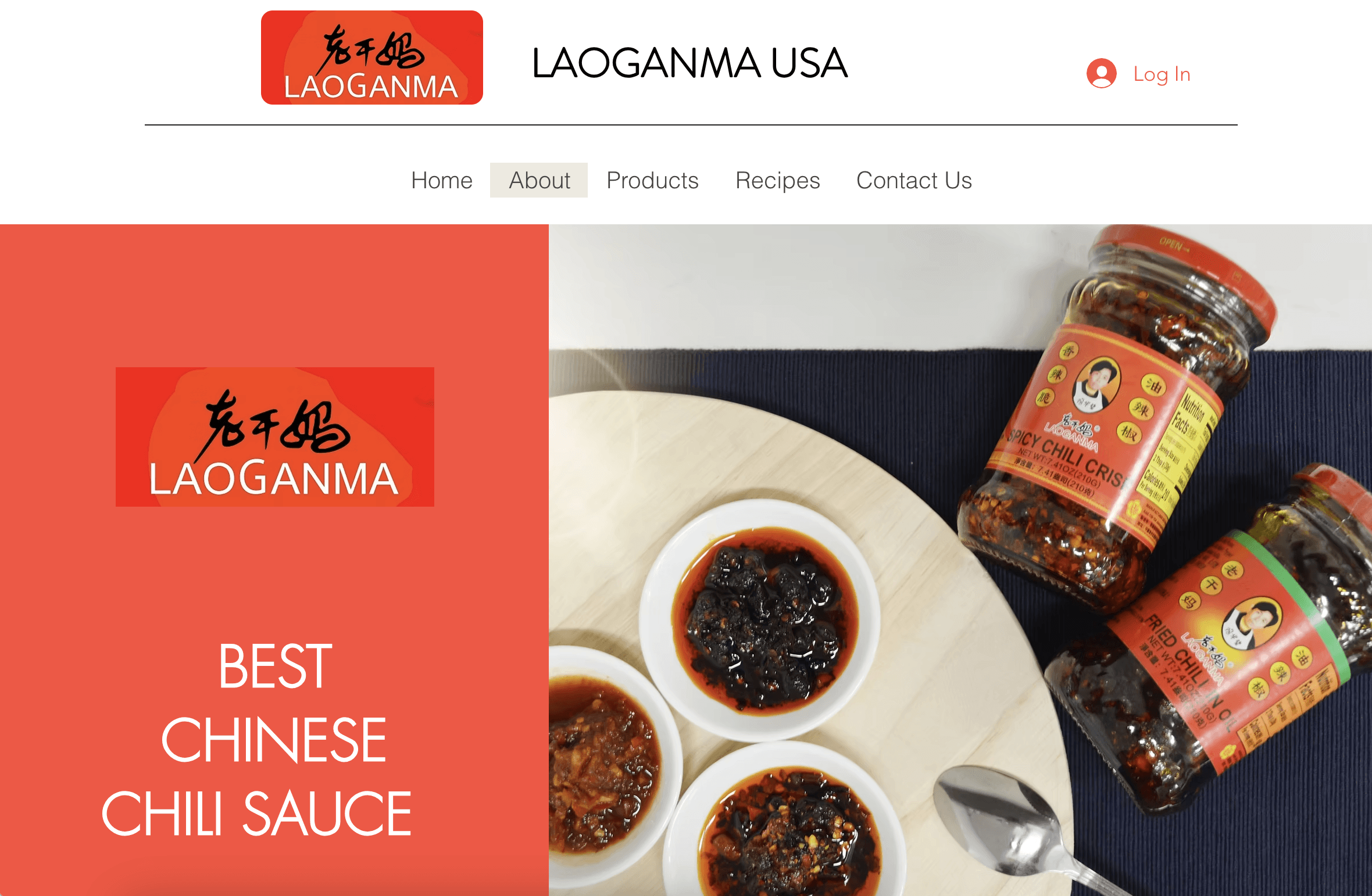
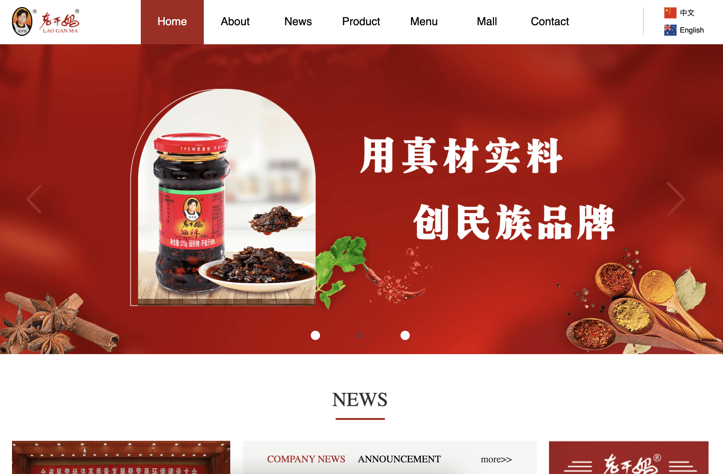
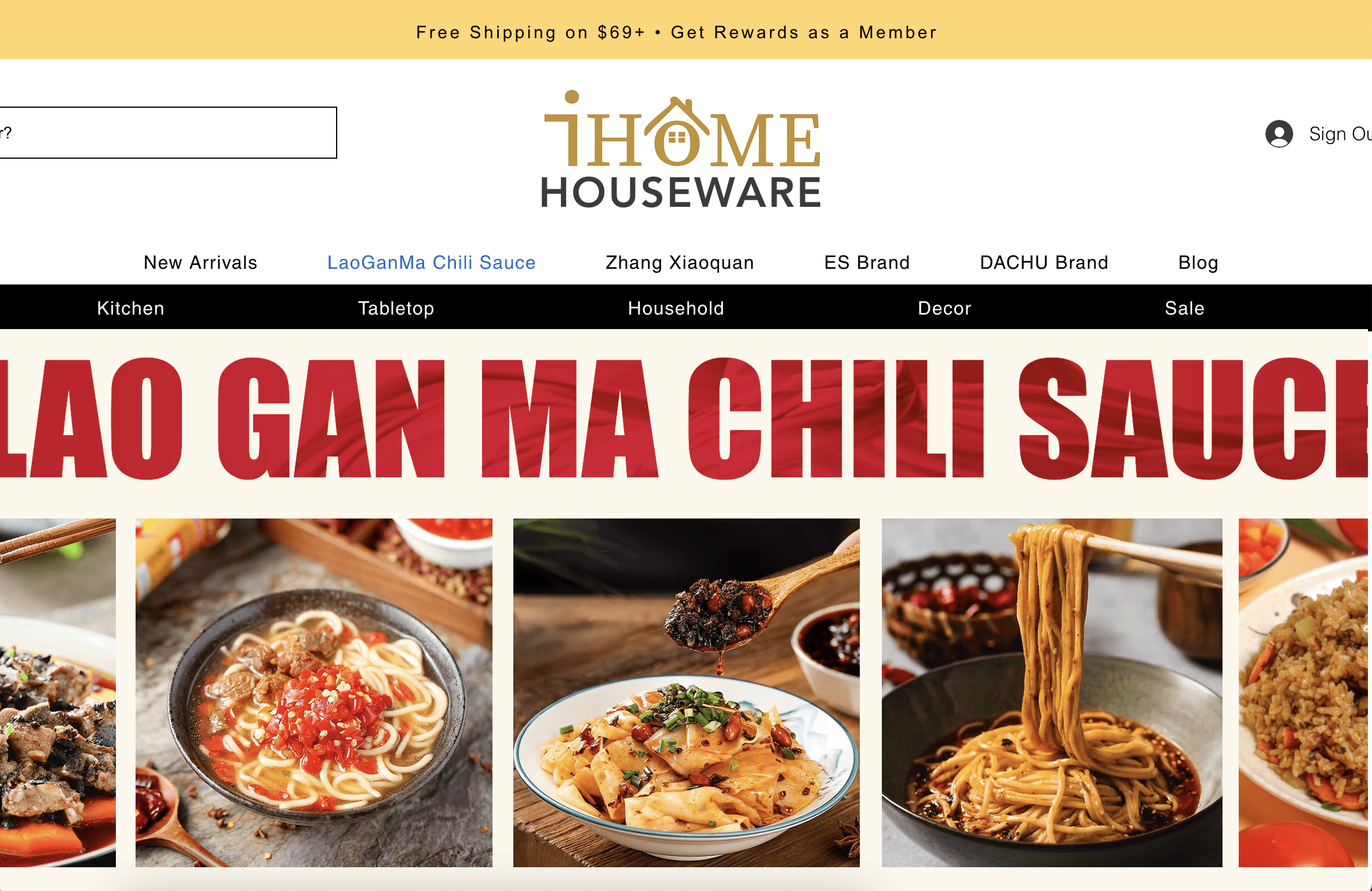
Though LGM dominates the shelves, their online presence is next to nothing
Laoganma's digital platform is limited to three separate, unconnected websites. Their visual identity (or lack thereof) is disjointed and lacks consistency because of design choices like poor layouts or illegible text.
For the biggest Chili Oil brand in China, everything feels cheap and amateurish.
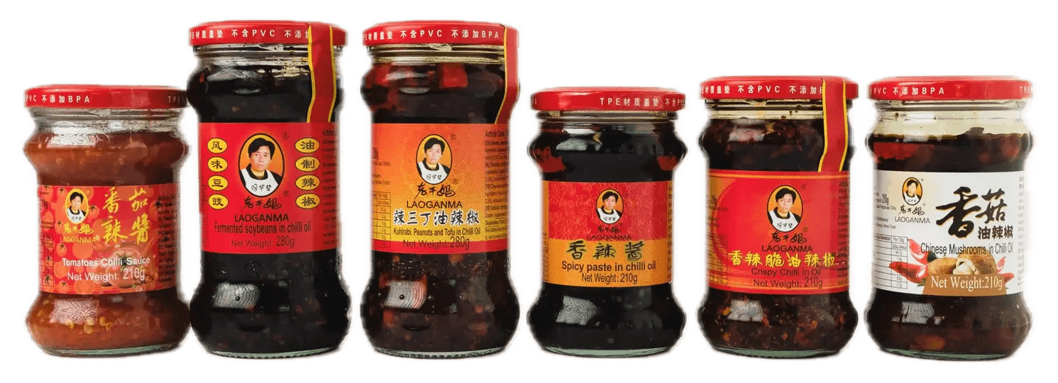
Iconic from afar, disordered up close
At a glance, these bottles are clearly Lao Gan Ma, with the iconic red lid paired with the logo of the lady. However, upon buying a bottle to analyze, I realized that none of the textures, patterns, or typefaces were consistent across products.
The accessibility concerns stuck out to me the most. The type is too small and low contrasted to be easily read, as well as being cramped with no visual hierarchy.
Visual analysis
Third times the charm
With all my research acting as a foundation, I started piecing together my new Lao Gan Ma identity. However, even after building a goal of what my design needed to do, I found myself without a vision. It took three iterations to get the final look down.
Leaning into heritage, but felt flat and tacky.

Minimalism with oil textures, but felt stripped of identity.

Bold font, warm colours, and clear traditional roots.
The logo was the hardest part. I needed to keep Lao Gan Ma’s iconic face recognizable while avoiding making her into a caricature. I landed on a gentle balance between her classic deadpan stare, while balancing it out with a welcoming cartoon style.

Use of AI
As this speculative redesign was for a school project, we were told that it was mandatory to use AI for it. For the first time, I incorperated AI into my workflow.
One example of this is generating mockups, and using Adobe Photoshop to create the designs.

Adobe Firefly was useful assistent in the process of this rebrand
Brainstorming -> idea generation -> lofi sketches -> concept development -> assets -> mockups
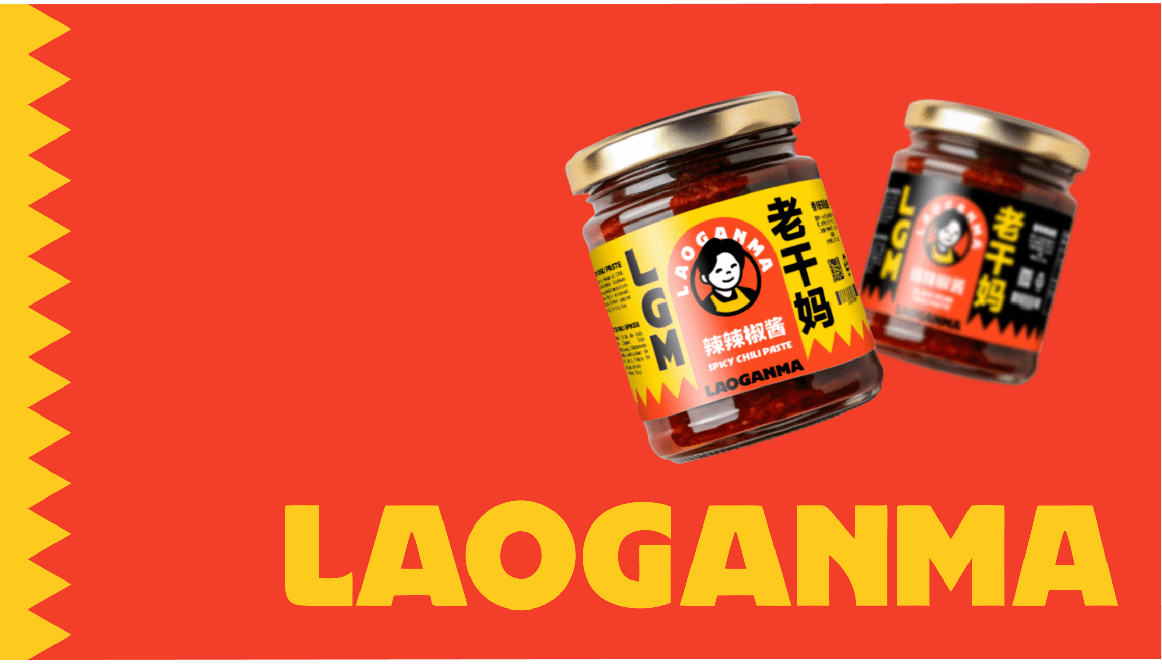
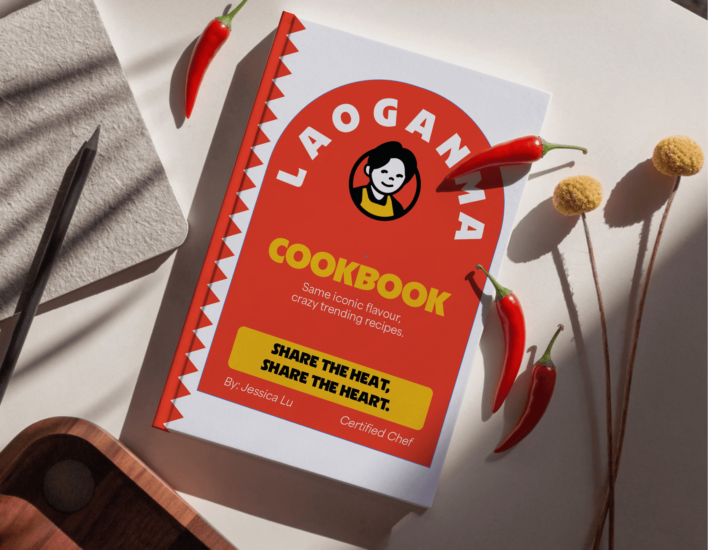
Delivering a new identity


This rebrand reimagines Lao Gan Ma as LAOGANMA, a bold and modern statement that’s still recognizable as the cultural icon it is. Through consistent visuals, the brand taps into social media culture and stands out on shelves, making LAOGANMA instantly recognizable and trend-ready.
Brand guidelines

This brand was carefully built to fulfil the three values I identified:
Authenticity
The colours are inspired by that of the original packaging, representing the dedication to authentic Chinese cuisine.
Product quality
The typefaces are easily legible, allowing the high quality ingredients on the label to shine.
Pride in tradition
The design doesn't shy away from its heritage, shown by use of both English and Chinese characters.
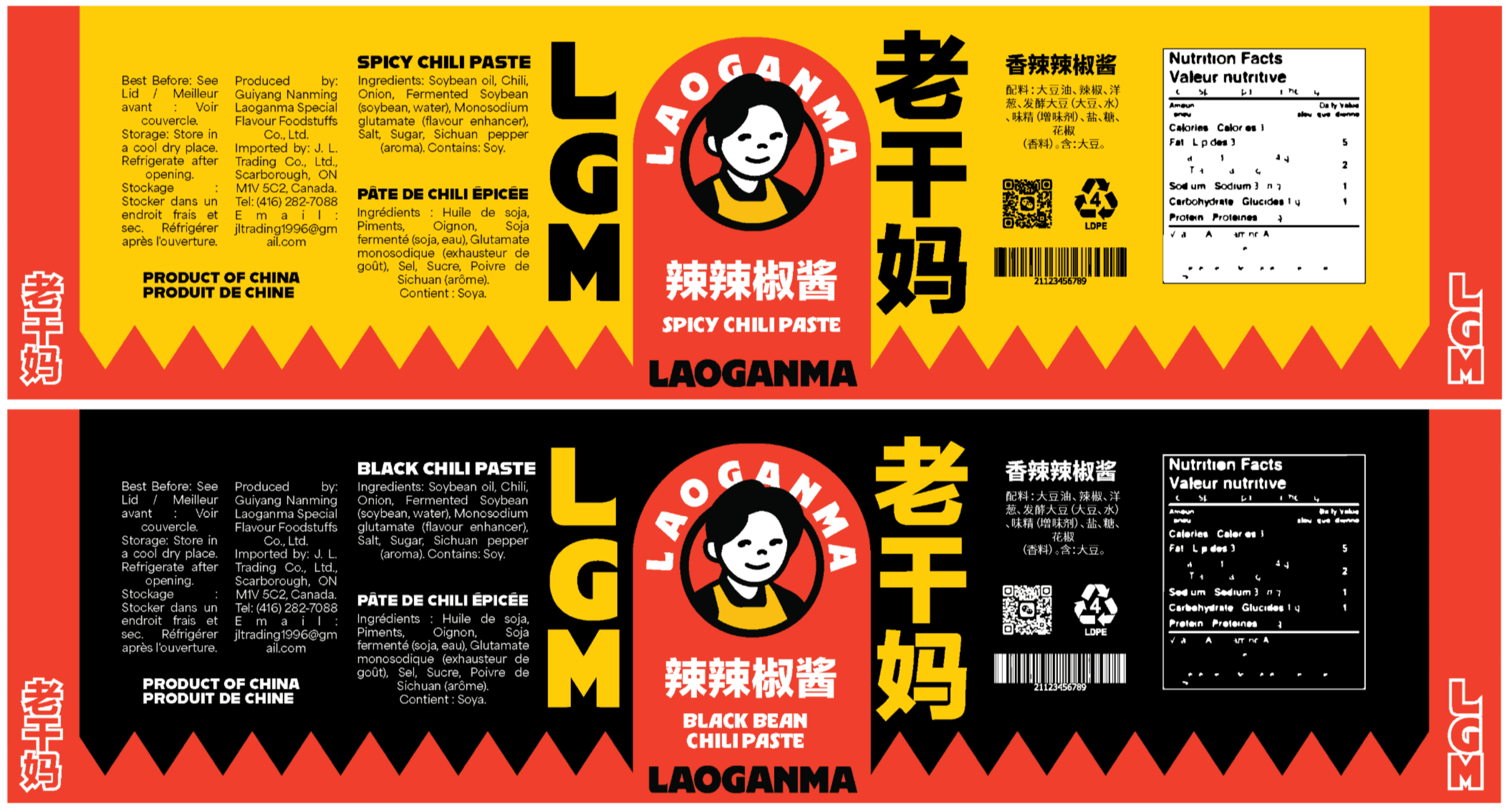
Packaging
Labels made with placeholder text and graphics. I developed labels for only two flavours because of tight time constrains, but the consistency across products remains the same.
Marketing
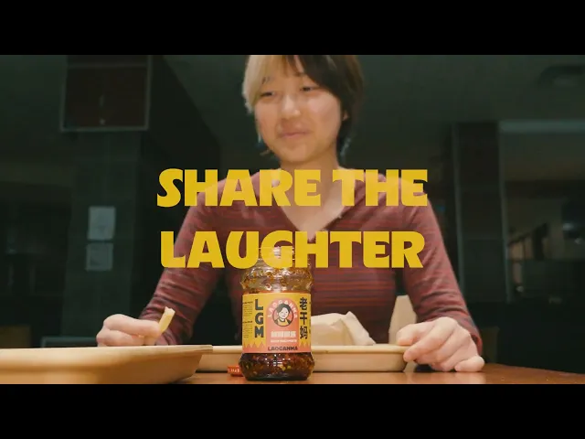
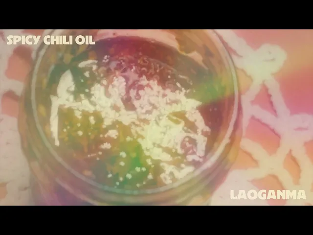
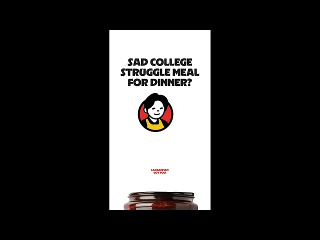
I developed three concept ad ideas to launch my rebrand.
Short-film/pathos
Billboard/visual
Tiktoks/humour
04
Final
What I'd do differently next time
Clarify constraints through further research
At first, I thought that having restrictions would block off my creative freedom. I went through so many visual iterations because I was developing them while I was researching. However, I found that the more I learned about the company, its users, and its competition, the more direction and inspiration I had. Next time, I would build a clear brief before diving into design with no plan.
Branding is giving a brand a voice, and for LAOGANMA, I gave it one to speak the language of Gen Z.
I learned how deeply branding today is shaped by social media, and how important it is for a brand to feel engaging and instantly recognizable. To take the brand story and turn it into something understandable/relatable is to connect it with an audience/customer base.
